Sentry Realty Website Design
← Back to Work

Product Design

Sentry Realty Website Design

Product

Sentry Realty website

I designed a launch website for Sentry Realty, a premium real estate brand formerly known as Senary. The work focused on establishing a prestigious online presence through editorial photography, elegant typography, and a restrained layout system across the homepage, portfolio, about, and news pages.

Details

Real estate website
surface
Visual / UI designer
role
2 designers and 1 software engineer
team
Visual design · UI design · Layout
scope
Homepage · Portfolio · About · News
deliverables

Context

Launch-ready from day one

Sentry Realty needed a website that matched the caliber of properties it represents. The brand was preparing for launch and required a digital presence that felt established, trustworthy, and visually aligned with luxury real estate, not like a template pulled from a generic property platform. Most visitors would encounter the brand online first, so the site had to do the work of building credibility before anyone stepped into a listing or spoke with an agent.

Visual direction

Prestigious, not pretentious

I leaned into aerial photography, serif headlines, and a muted gold accent to signal premium positioning without tipping into excess. The layout stays minimal so photography and property details lead, with navigation kept simple across portfolio, about, and news. Spacing, type scale, and image treatment stay consistent page to page so the site reads as one brand system rather than a collection of separate screens.

Outcome

A cohesive launch site

The result is a full set of page designs ready for launch: a hero-driven homepage, portfolio listings, and supporting about and news templates that present Sentry Realty as a modern, high-end real estate brand online.

Goals

I wanted the site to feel premium from the first screen while remaining easy to navigate. The goals were to establish a strong visual identity for launch, give property listings a clear hierarchy, and extend the same design language across supporting pages without overwhelming the photography.

Process + Key Insights

I started with the homepage to set the brand tone, then built out portfolio, about, and news around the same type scale and spacing. Defining that foundation early made the later pages faster to design and kept the supporting sections feeling like parts of one product rather than separate one-off screens.

Reflections + Takeaways

This project showed that luxury real estate design is as much about restraint as richness. Letting photography carry the page and keeping navigation minimal made the brand feel more confident. A clear template system across pages mattered more than bespoke layouts for every screen.

Style guide

COLORS

F1A024

(ACCENT)

2A2E36

(BG)

F8F8F8

(BG LITE)

1A1A1A

<H1>

000000

<P>

FONTS

Main Titles

Baskervville

60

The paragraph text

Gudea

18

Design
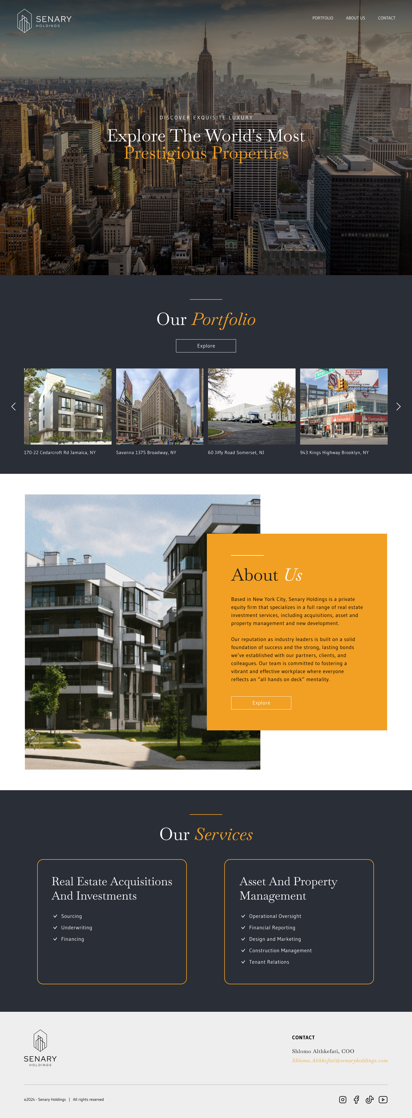
Sentry Realty homepage design

Landing page

The homepage sets the tone for the entire launch. I wanted Sentry Realty's first impression to feel prestigious and confident, with photography and typography that signal luxury real estate without feeling cold or inaccessible.

Hero moment: Full-bleed aerial photography anchors the page, with a serif headline that highlights "Prestigious Properties" in a muted gold accent.

Navigation: A minimal top bar keeps Portfolio, About Us, and News easy to reach while letting the hero image carry most of the visual weight.

Below the hero, I laid out sections that introduce the company step by step, with a portfolio preview, an about block with photography and firm background, and service cards covering acquisitions and property management, so first-time visitors understand what Sentry does before going deeper into the site.
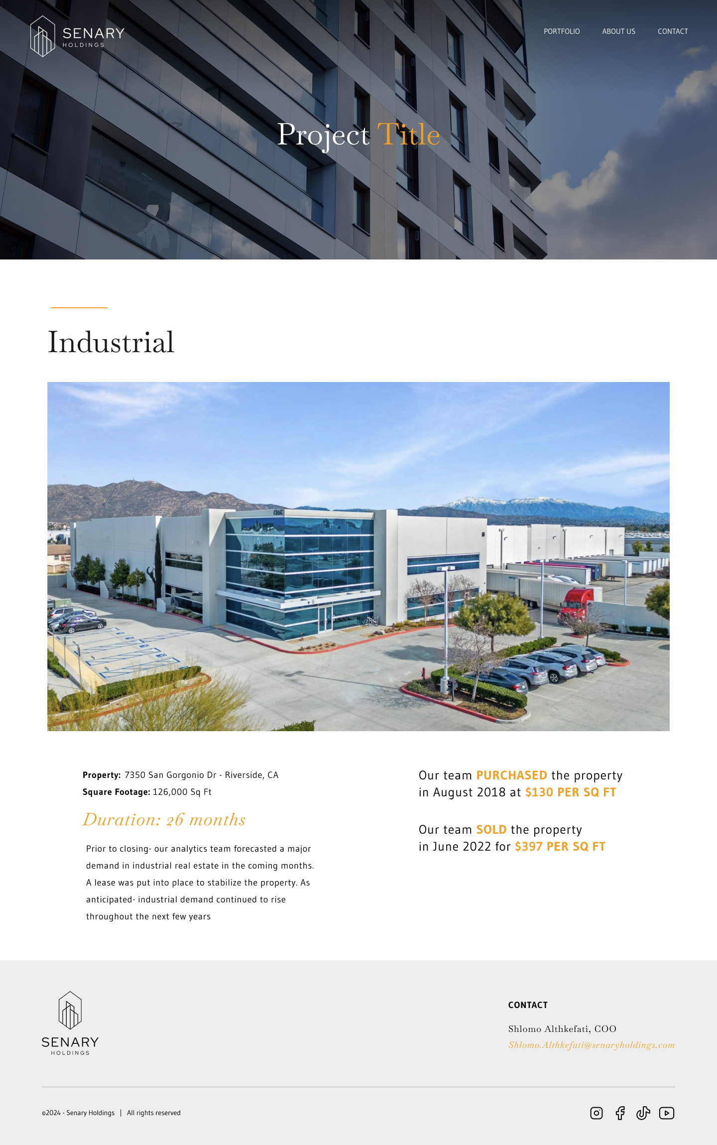
Sentry Realty portfolio project detail page design

Portfolio

Each portfolio item opens into a project detail page for a single property profile. The layout leads with the property type and photography, then splits into two columns: investment context and timeline on one side, purchase and sale highlights on the other, with key figures in the accent color so the deal story is easy to scan.
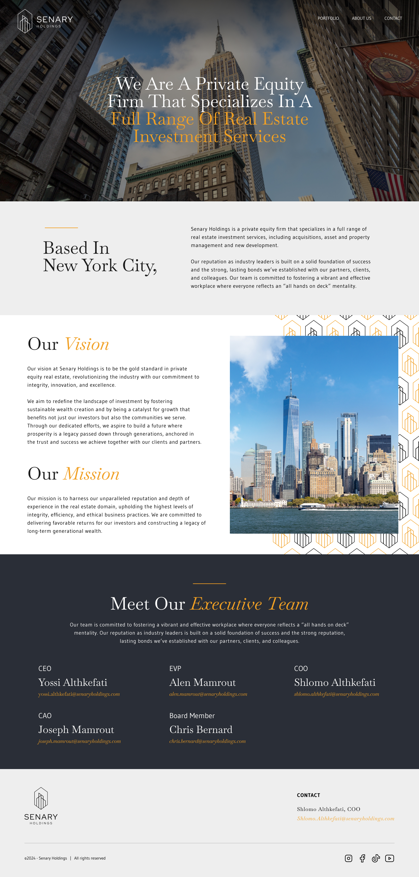
Sentry Realty about us page design

About us

The about page carries the brand story beyond individual listings. I designed it to feel established and trustworthy, matching the premium positioning set on the homepage.

Brand story: Photography and short sections introduce the company with a clear hierarchy that feels editorial rather than corporate.

Visual consistency: Serif headlines, restrained spacing, and the same muted palette extend the homepage language so the about page feels native to the rest of the site.
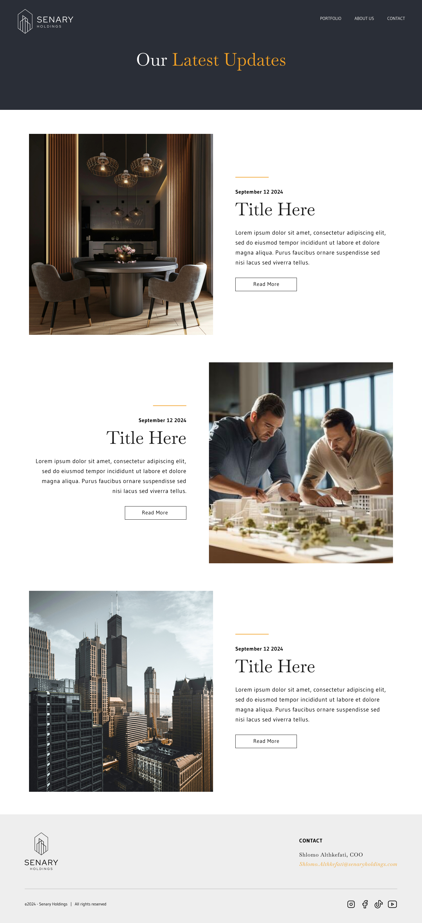
Sentry Realty news page design

News

The news page gives Sentry Realty a place to share market updates, company milestones, and property highlights. I treated it as a content layer that supports the brand without competing with portfolio browsing.

Article grid: A template for featured stories and recent posts, organized in a scannable layout so visitors can browse updates without losing the site's calm, premium feel.

Content templates: Article layouts reuse the same type scale and spacing as the rest of the site, keeping news pages cohesive with homepage and portfolio templates.